Round: A Desktop Interface to Provide a More Interactive Video Conferencing Platform
Deliverables
Interactive prototype
Annotated Wireframes
User Flows
Persona / Empathy Map / Story Board
My Role
IxD Design
User Research
User-Centered Design
Usability Testing
Tools
Figma
Otter.ai
Miro
Details
5 Weeks
3 Team Members
Academic Project
The Challenge
Due to Covid 19, instructors and event hosts have had to migrate to online sessions, therefore lacking the in-person experience they are more comfortable with. Our challenge was to build a video conferencing platform for hosts/organizers who want to share their skills or knowledge. We had to make sure we offer users an interactive experience that meets their event’s needs.
Analyzing The Competitors
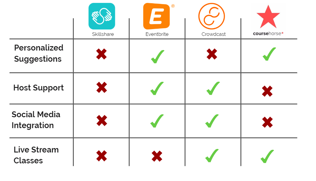
Through competitive analysis we were able to study the strengths and weaknesses of competitors in the remote learning platform and event management software markets.
An interesting finding was that the remote learning platform and event management software markets are crowded. However, there isn’t a platform that we could find which combines both aspects of this market.
Design Principles
From our domain research and client insights, we created a set of design principles to help guide our process and justify our design decisions. We revisited these throughout the process to ensure they are up to date with any new findings.
Interactivity
Help users foster collaborative and immersive communities where all can easily engage with each other to better reflect the in-person experience.
Authenticity
Help users create space for genuine and meaningful connections and conversations, enriching users experiences.
Inviting
Make users feel welcome by providing a cohesive, flexible and approachable visual language and copy.
User Research
Once we had better knowledge of the domain and the market, we moved on to understanding what the goals and frustrations are of users who are in the need of a better online-event organization tool. After obtaining all the required data from 11 participants, we carried out affinity diagramming to synthesize the data.
What We Learnt From Our Interviews:
Users want control over their planning & management process
User migrated their events online because of Covid-19
Online learning and teaching is more accessible to everyone
What Our Users Need:
Users are motivated by community-building & connection
They find it difficult to recreate an in-person experience online
Interaction and feedback is highly valued
“Communication and collaboration is harder if all their cameras are off. If I'm in-person, I can look around the room and at least tell that they heard” - Danny
Understanding The User
Let’s meet Cynthia. From our research, we created this persona to best reflect our target audience.
Cynthia W.
(32 yrs old, Marketing Analyst/Baker, NYC)
Wants to give back to her community
Feels disconnected from her attendees
Appreciates validation from positive feedback
To further empathize with the users I also created an empathy map and story board which helped us better understand the users’ needs, frustrations, habits and goals.

Problem Statement
Current platforms leave independent online instructors and organizers who value authentic interaction and feedback feeling disconnected because their attendees seem disengaged. They need a tool to better replicate the social dynamics of the in-person experience.
Ideation
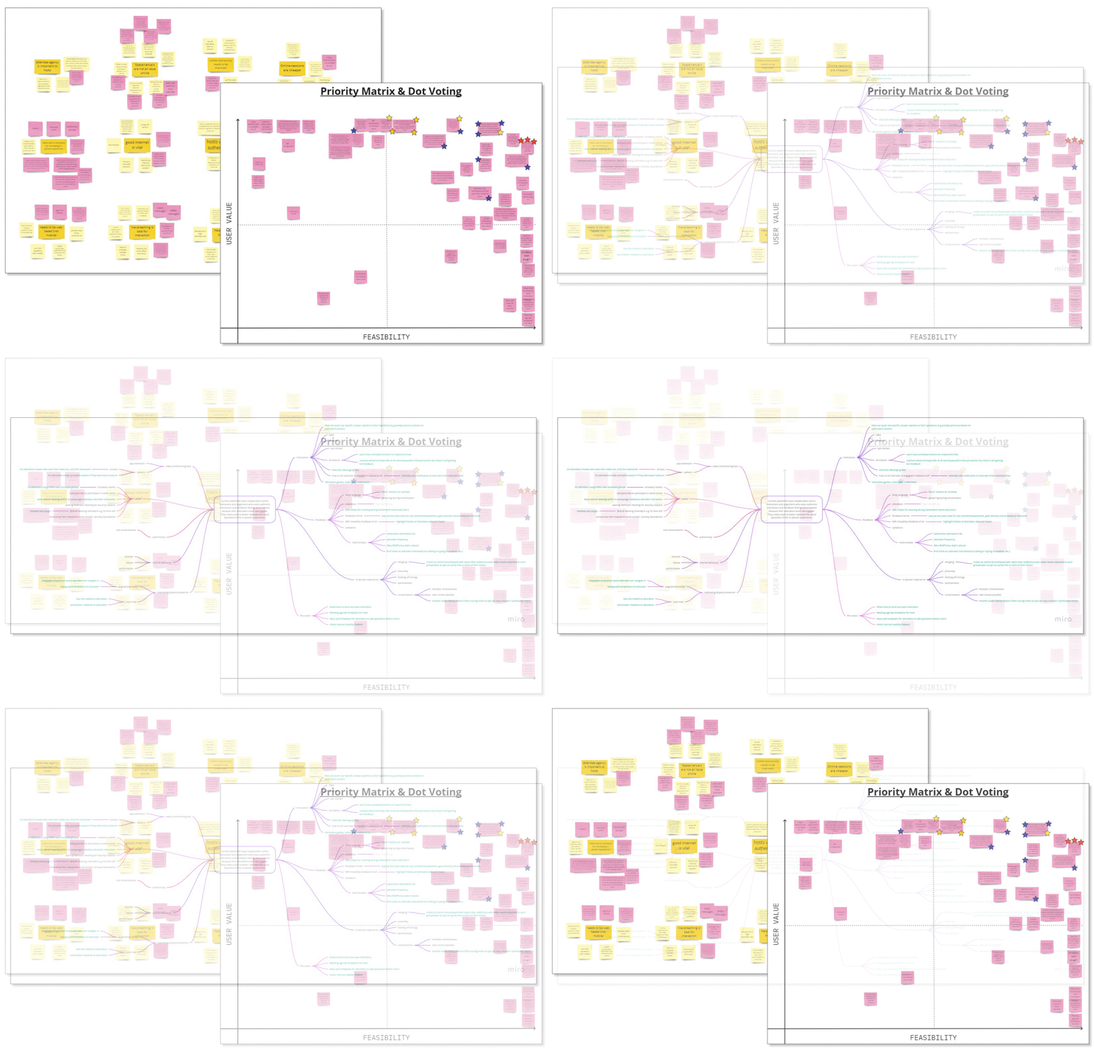
After carrying out research on the market and empathizing with users to understand their needs, we moved onto brainstorming and ideating to try and find the best solution. We carried out two ideation methods, the first being mind mapping, followed by challenge assumptions. We found that challenging assumptions helped us develop additional ideas. From these ideas we went onto completing a priority matrix and then dot voting to finalize on 3 divergent concepts.
Divergent Concepts
From our selected concepts, each team member designed wireframes and prototypes to test with users. From the usability test responses, we decided to focus on ‘Round’ which was the most preferred concept with added post-metric features which was highly favored from ‘Session.’
Round
Concept: A more authentically interactive video conferencing software with navigable avatars, simulated room themes and collaborative breakout sessions.
Usability Test Findings:
User were enthusiastic about the interactions
This concept holds a unique value proposition
Session
Concept: A video conferencing tool that enables attendees to provide real-time feedback via emoji-inspired reaction stickers.
Usability Test Findings:
It does not hold a unique value proposition
The post-event report received enthusiasm
Pollycast
Concept: A video conferencing tool which allows hosts to interact with attendees through polls and ice-breaker games
Usability Test Findings:
Zoom already has a poll feature
This is a more feature based concept
User Flows
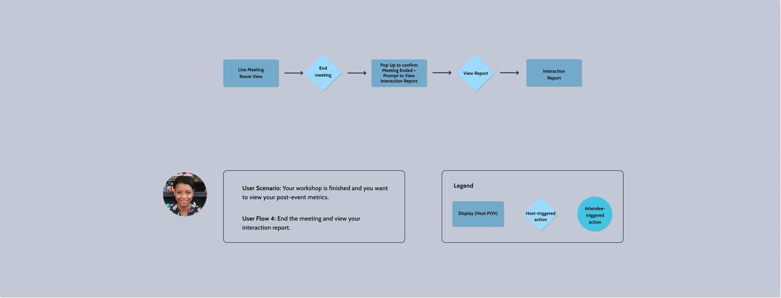
Before creating the wireframes for the final solution, we decided to create user flows to ensure that users are able to achieve their goals in a clear and seamless manner.
The Solution
From the convergence of our concepts, we came up with Round. This platform simulates a physical environment helping replicate an in-person experience in order to provide a fun way for hosts to promote authentic interaction and engagement in their online workshops.
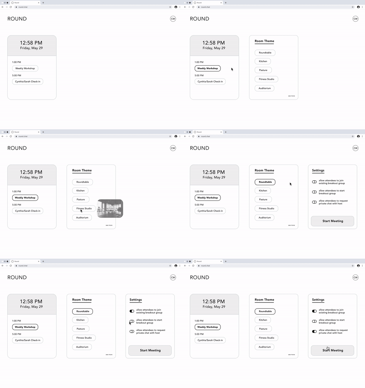
Simulated Settings
Hosts have control over the following:
Choosing a range of room themes to suit their varying purposes
Allowing attendees to join existing breakout rooms
Allowing attendees to initiate private chats with the host
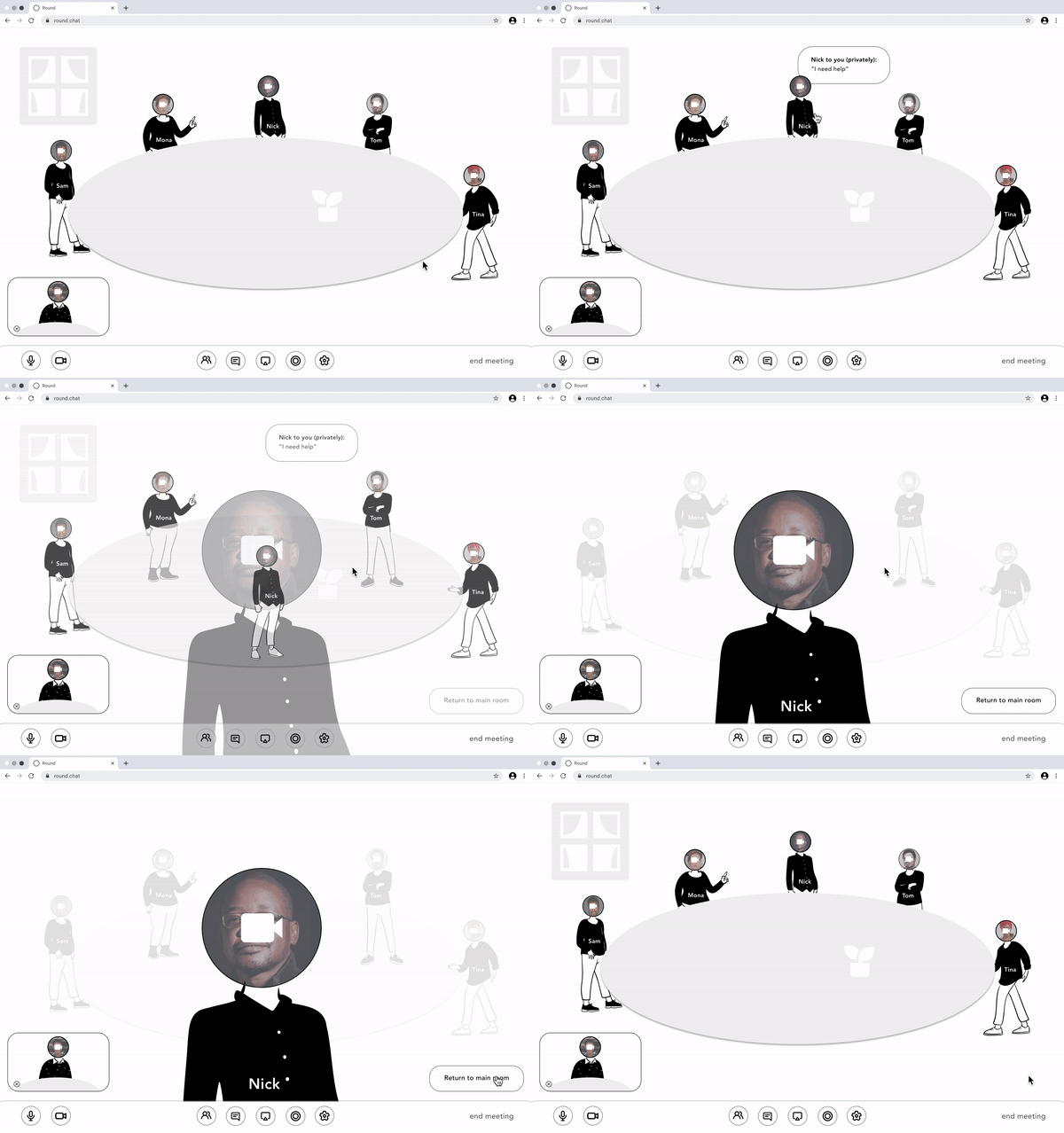
Private Conversations with Host
Attendees can have control of requesting private chats with the host
Attendees camera moves towards the screen & enlarges to mimic the in-person experience of a private conversation
Host has self-view window in bottom left with a room view in the background
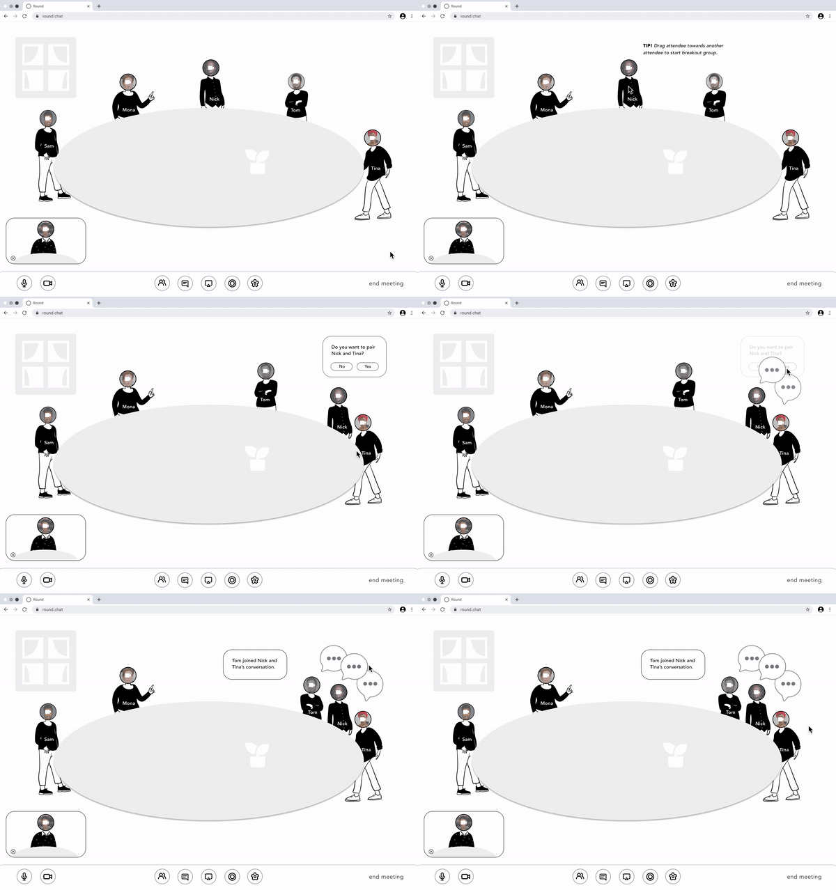
Collaborative Breakout Sessions
Hosts can click & drag attendees to create breakout sessions
Host receives notification when an attendee creates or joins a breakout session independently
Animated visuals & speech bubbles allows hosts & attendees to know who is collaborating with whom
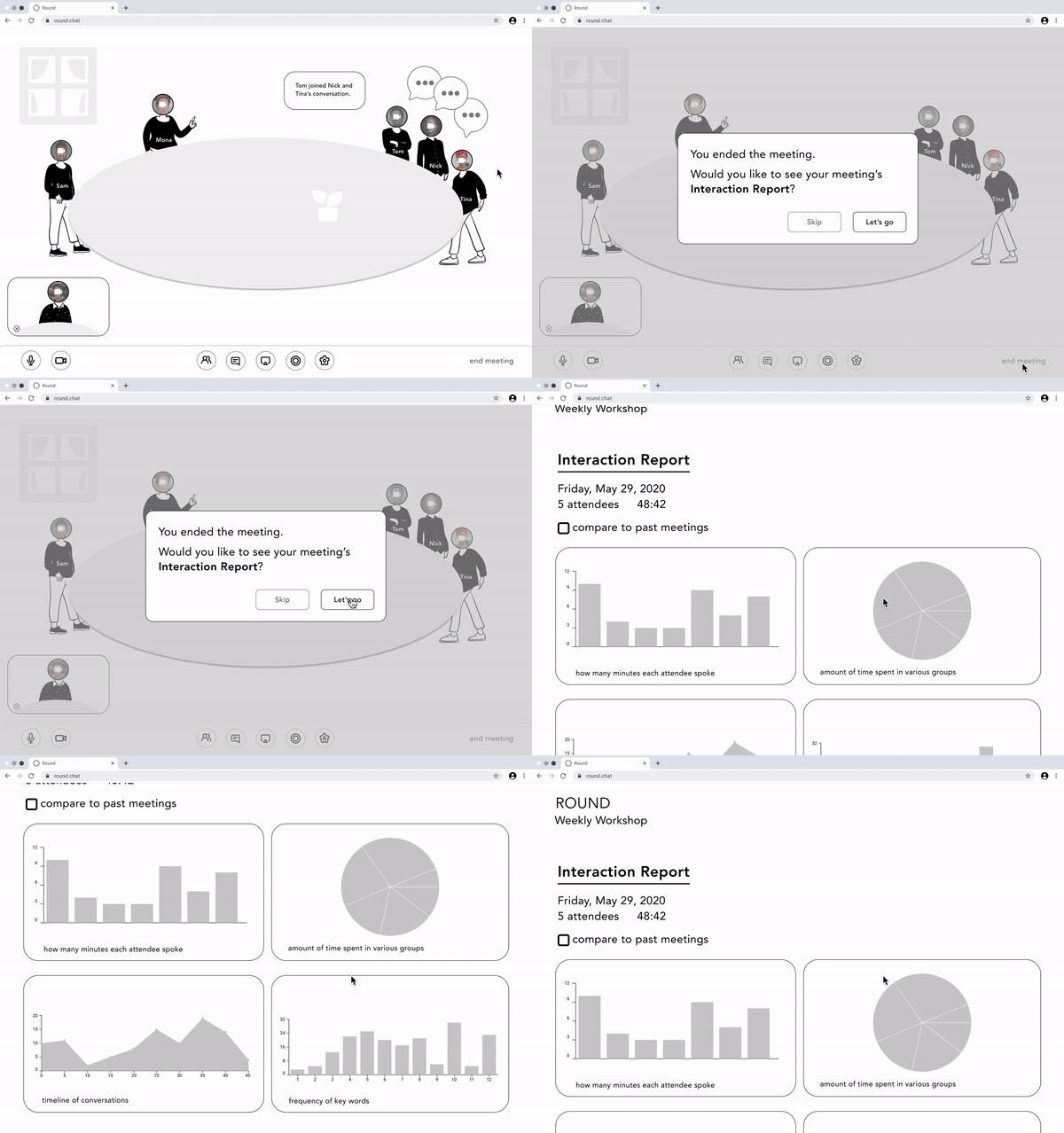
Interaction Report
Post-event metrics report can be viewed to see detailed insights of attendee engagement and interactions
A summary is provided in the form of charts & diagrams
Usability Testing
To test our final solution, we carried out a usability test with 5 users; 3 class instructors & 2 event organizers. We had the following findings:
Replicated In-person Experience
The concept & layout of attendees being arranged around a virtual shared space felt more organic & comfortable to users. The interactions with the attendees feel more natural & life-like.
Interactions, Animations & Illustrations
The interaction design, animations and illustrations mimicked a video-game style of navigation and engagement that brought joy to users.
Suits Wide Audience
Different room themes empowered hosts to use the platform for different purposes, and they were enthusiastic about the ability to use it for diverse audiences and simulated environments.
Post-Event Metrics Report
They also highly valued the post-meeting metrics report at the end and found it helpful.
What the users had to say about ‘Round’
“I really like this interaction of being able to drag people and moving them around, because it’s kind of like pairing them up in a real-world setting.”
— Female, Age 22 yrs
“Having distance from people’s faces and seeing them arranged in a room feels more organic than Zoom’s wall of faces.”
— Female, Age 29 yrs
Annotated Wireframes
Although this was a mock project, we went ahead and annotated some wireframes to explain why an interface element is placed in a specific location and what the interaction model is for the element. It also helps establish a clear information hierarchy for the design solution.


Next Steps
From our usability tests of the final product, we made the following suggestions based on what our users said:
Add Customizable Room Themes to empower hosts to use the platform meaningfully for various purposes.
Offer Customizable Avatars to add a more fun element to the platform.
Further Research on the Metric Report to find preferred ways that the host can access their event statistics after their events.

